
Operating systems have changed significantly over the last few decades. From capabilities to release cycles to dependence on internet connectivity, the operating systems we use today are a far cry from those we used in the early 2000’s. In most ways, they’ve become more useful. But there are a few regressions, in my opinion. Among them is the operating system theme.
There is a raging debate over what is easier on the eyes: light or dark mode. And like most other issues in our society, it can be a very polarizing issue. All or nothing, pick one side, no concessions. But this has presented many of us with an unreasonable choice. The standard operating system theme today is either bright as the sun or dark as a cave. No in between. No medium tones.
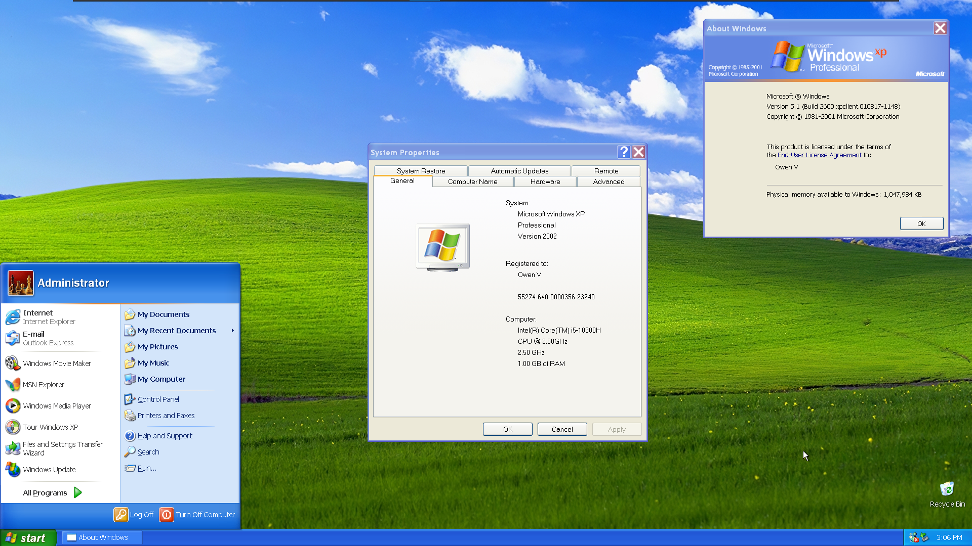
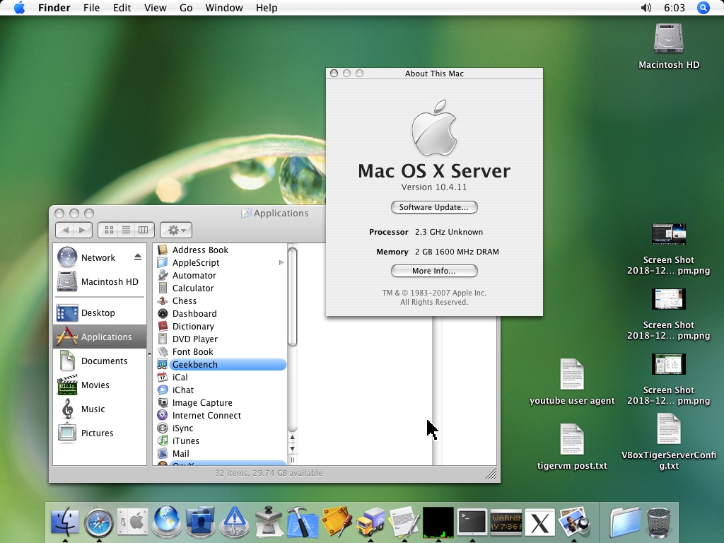
And this is where I think older operating systems did a better job. They used light, medium and dark tones together. Look at the color palette of Windows XP or OS X Tiger. Sure, the designs are dated by today’s standards, but users did not have to choose between one extreme or another. Instead, they got a well-balanced experience.
By contrast, the experience in modern operating systems is rather jarring. The elements on the screen are either all bright or all dark. The user gets a choice, but it’s like choosing between bad and worse. If you use a dark theme and browse to a website with a white background, it actually kind of hurts. It’s not quite as bad the other direction, but it still sticks out and looks wrong.
Apple and Microsoft both provide light and dark themes (or modes, depending on marketing jargon). Both tend to be either incredibly bright or incredibly dark. All of the elements are either light or dark. No balance. Nothing in between. (Although I will admit macOS does a slightly better job of this.)
In the Linux world, the most popular desktop environment is called GNOME. It ships two themes: Adwaita and Adwaita Dark. They are basically stark white and nearly black.
Why is this a problem? Eye strain. The research is mixed in terms of light or dark themes, but most studies indicate that one or the other causes eye strain. As usual, it probably depends on who paid for the study. The biggest problem with either one is that, as a general rule, extremes tend to cause problems. Balance seems like a much better option, but operating system vendors have abandoned that idea.
As for me, I prefer a theme with a balanced color palette. Light mode and dark mode are too extreme. But since I am forced to choose between bad and worse, I prefer dark themes from a purely aesthetic perspective. But because of my astigmatism, dark themes cause me problems, so I usually have to go with a glaring white screen, which is awful.
(Yes, the astigmatism thing is real. If you have astigmatism and prefer a dark screen, you may find that you have trouble focusing on things after awhile. Just like driving at night.)
Vision issues aside, some of us just find “blinding” mode and “black hole” mode to be equally ugly. Come on, operating system vendors. Remember when you used to make nice things?