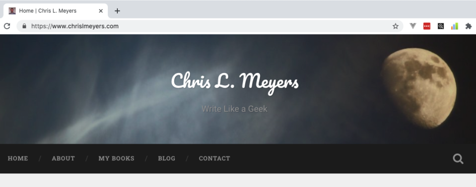
Chrome’s omnibox is excellent and terrible at the same time. On one hand, you can search or go straight to a URL without picking a different spot for each task. On the other hand, some weird design decisions have made it difficult to use.
Let’s start with what the omnibox is. It’s the bar toward the top of the screen where you can type in the URL you want to go to. Or you can search. It’s a convenient way to do whatever you want in one place.
Most browsers use this mechanism now. But I’m unhappy with a few of the choices the Chrome developers have made in terms of usability.
Firefox is my browser of choice these days, but as a web developer I still need to use Chrome regularly. So I’ll discuss the problem and then show you how to fix it.
The problem
First, a single click in the omnibox highlights all the text in the box. This is contrary to how a single click behaves in most other parts of my operating system. Single click should put a cursor where I clicked, not highlight the entire line. So if I want my cursor at a certain point, I have to click once, wait, then click the spot I want.
I’m not a fan of this design, but I understand the rationale. Most users click the omnibox with the intention of typing a url or a search. Not to edit what’s already there. I get it.
But for argument’s sake, let’s say I want to edit part of the URL. Now I have a problem.
I click once, the entire line highlights. I click again on the spot where I want my cursor and suddenly all the text shifts over. Where did my spot go? Now I have to look for it again before I can edit.
This is really bad design. What idiot would think that’s a good user experience? I don’t get it.
Why is this happening? Because of another poor design decision. Most URLs look something like this (using my site as an example): https://www.chrislmeyers.com. This is the actual URL.
What Chrome shows you is: chrislmeyers.com. This is not an actual URL. It hides the scheme (https) and the subdomain (www) from you.
This behavior is bad enough on its own. It’s rarely a good idea to un-educate people or to encourage ignorance. These pieces of the URL are important. People should see them.
The biggest usability problem is the design’s impact on my attempt to highlight part of a URL or place my cursor in a specific spot. Clicking once highlights all the text in the box. Clicking again reveals the scheme and subdomain, shifting the text to the right. My cursor is no longer hovering over the text I wanted to click on. This is frustrating and very poorly done on Google’s part.
Imagine if one of your other applications did this. What if Word waited until you moved your mouse over the save button, then moved the button to the right. How useful would that be?
The solution (for now)
Fortunately, Chrome has begrudgingly provided an obscure way to fix this. First, click in the URL bar / omnibox and type: chrome://flags. Hit enter.
In the search box at the top, type: omnibox-context
You should see a setting called “Context menu show full URLs”. Set that to enabled. Restart Chrome.
You would think that would be it, but you’re not done yet. Now you need to right-click in the omnibox and click on “Always Show Full URLs”.
Now your browser will behave like it should. I hope this helps someone other than just me.
If Chrome changes this behavior and hides the setting in a different spot (They’ve already done it at least once), I’ll make sure and update this post accordingly.

